
Elegant Evolution of the New Airbus Logo highlights modern design, global branding, and innovation shaping Airbus’ identity in today’s aviation industry.
Table of Contents
History and Evolution of the New Airbus Logo
The New Airbus logo has undergone changes since the company’s inception. Airbus was founded in 1970 by a consortium of European aerospace manufacturers. The original logo reflected the international cooperative effort, incorporating elements that represented the different founding countries. The early logo resembled an abstract bird, referencing aviation while incorporating the national colors of the original partner countries: Germany, France, the UK, and Spain.
In the early years, the logo emphasized the collaborative spirit. This was crucial for establishing a strong and recognizable identity in an industry dominated by American manufacturers. As Airbus grew and launched successful aircraft like the A300, the logo evolved. The bird-like design became simplified, leaning towards a more modern and sleek representation. This shift mirrored the company’s technological advancements and expanding global presence.
By the 1980s, Airbus had introduced a redesigned logo. This iteration featured a bold, italicized Airbus text with a stylized wing that symbolized flight and innovation. This period saw Airbus competing directly with Boeing, their major American counterpart. The logo underscored a commitment to cutting-edge technology and engineering excellence. As Airbus continued to redefine aviation with models like the A320, their New Airbus Logo became a symbol of quality and innovation.
The Blue Sphere and Modernization
In 2001, Airbus unveiled a New Airbus Logo, reflecting a major rebranding effort. The updated design featured a blue globe with curved, swooshing lines, representing global connectivity and the seamless experience of air travel. The word Airbus was rendered in a clean, modern font, conveying the company’s forward-thinking philosophy. The blue color palette was chosen for its association with trust, stability, and professionalism.
This logo coincided with Airbus’ significant milestones, such as the launch of the A380, the world’s largest passenger airplane. The new design aimed to highlight the company’s role in transforming aviation. The globe element in the logo asserted Airbus’ position as an international leader in aerospace, emphasizing their global reach and impact. The branding shift was not just about aesthetics but also about reinforcing Airbus’ strategic goals.
Current Branding Strategy
In recent years, Airbus has maintained a consistent yet evolving branding strategy. The 2014 update kept the essential elements of the blue globe and modern font but refined the visual presentation. Airbus dropped the globe icon from some applications, relying on the name’s strong recognition instead. This streamlined approach aligns with contemporary branding trends focusing on simplicity and adaptability.
Airbus’ current branding emphasizes innovation, sustainability, and efficiency. The color blue remains a core element, symbolizing trust and reliability. The company also uses green shades to highlight their commitment to environmental sustainability, particularly in their initiatives to develop electric and hybrid aircraft.
Logo Application and Corporate Identity
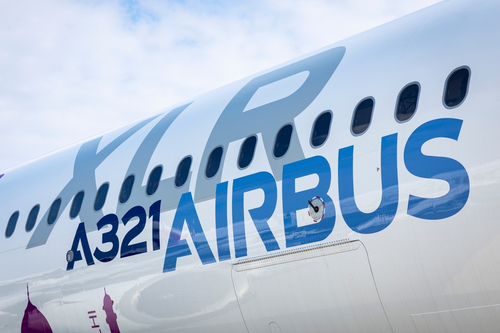
The New Airbus Logo is prominently featured across all company assets. It appears on aircraft, marketing materials, digital platforms, and corporate uniforms. Its application adheres to strict guidelines to ensure consistency and brand recognition. The design’s simplicity allows it to be effectively adapted for various media, including print, digital, and three-dimensional formats on aircraft fuselages.
Internally, the logo fosters a sense of unity and pride among employees. It represents not only the company’s achievements but also its ambitions and future directions. Externally, it serves as a guarantee of quality and innovation to customers and partners. The consistent use of the logo helps reinforce Airbus’ brand identity in an easily recognizable way.
Influence of Corporate Trends
Corporate trends have influenced changes in the Airbus logo over time. In the 1970s and 1980s, logos across many industries favored detailed and illustrative designs. As graphic design evolved towards minimalism in the late 20th and early 21st centuries, Airbus followed suit. This shift to simpler, cleaner designs was driven by the need for versatile branding that works across diverse platforms and media.
Today’s corporate branding often emphasizes sustainability and global connectivity. Airbus’ logo and branding strategy reflect these trends. The use of green alongside blue in their color palette highlights their environmental initiatives. The modern, streamlined design conveys a sophisticated, forward-thinking company aligned with current aerospace and technology advancements.
Consumer Perception and Brand Loyalty
Consumer perception is crucial for any brand’s success. Airbus’ logo plays a significant role in shaping public perception. The clean, modern design communicates innovation and reliability. The color scheme fosters trust and stability, essential traits for an aerospace company. Regular updates to the logo ensure it remains relevant and resonates with contemporary audiences.
Brand loyalty is built on consistent quality and positive experiences. The Airbus logo has become synonymous with high standards in aviation. Passengers, airlines, and industry stakeholders associate the logo with advanced technology and safety. This positive association helps maintain strong brand loyalty and market position.


Stay in the loop
Get the latest aircraft insider updates delivered to your inbox.